One Sourz
Refreshing the Identity of One Sourz
Visual Identity · Packaging

Overview
During my tenure at Food Experience Designery (FED) as an intern, I had the opportunity to lead the rebranding of One Sourz, an established organic brand specializing in coconut oil, sesame oil, groundnut oil, and a range of chikkis and laddos.
Studio
FED, Chennai
May 2023 - July 2023
Concept to Logo
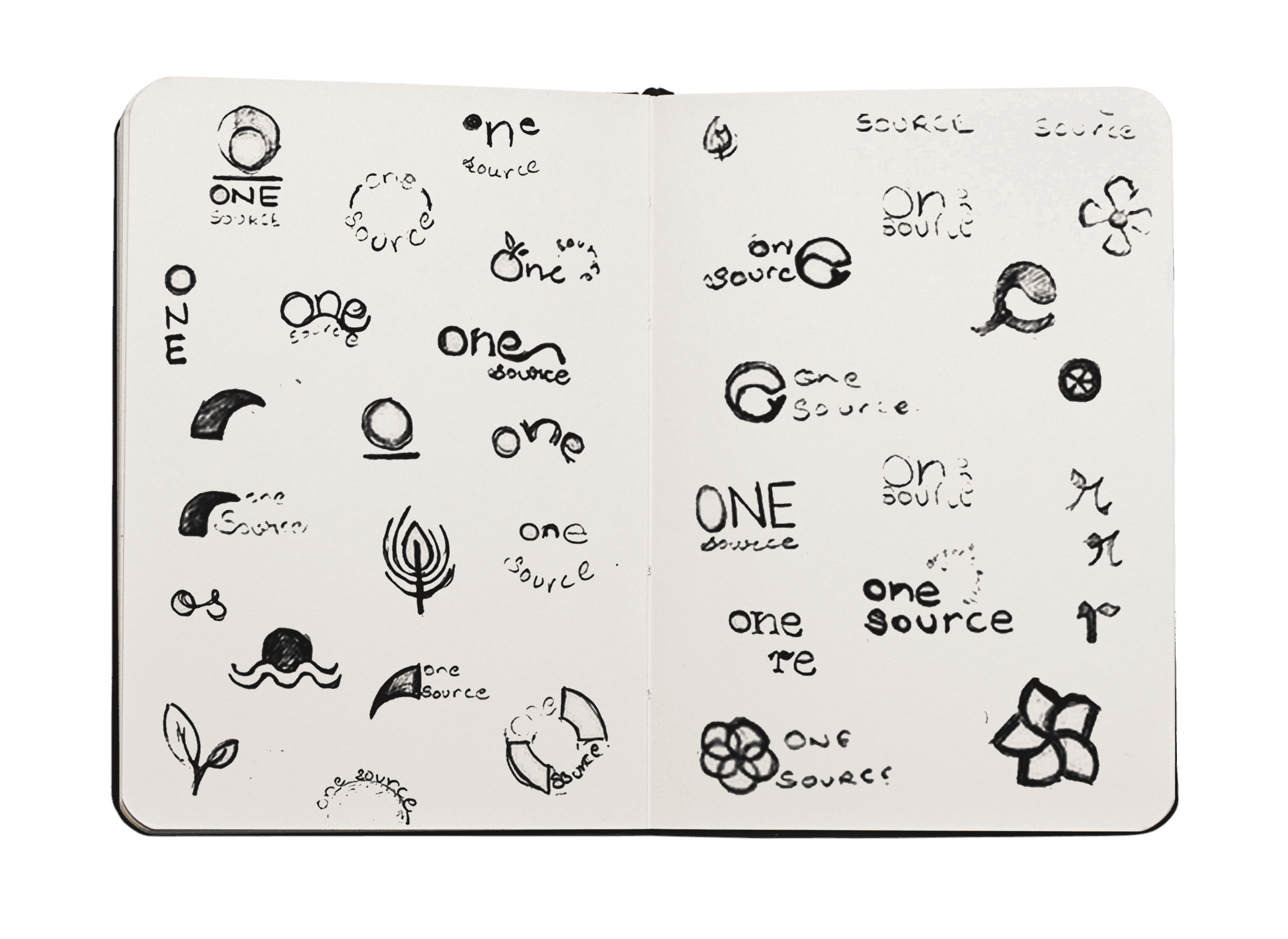
The creation of the One Sourz logo began with brainstorming and sketching, with the goal of retaining the five elements—earth, water, fire, air, and space—into the design. Regular feedback from the brand team helped refine these ideas, ensuring that the logo aligned with the brand’s organic roots.

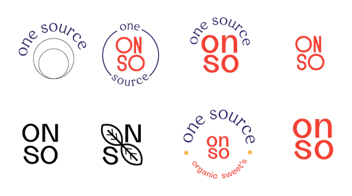
Previous Logo

Exploration 1.ai*
explorations 2.ai*
explorrrrrr 3.ai*
explor final 1.ai*
exploraton final f.ai*
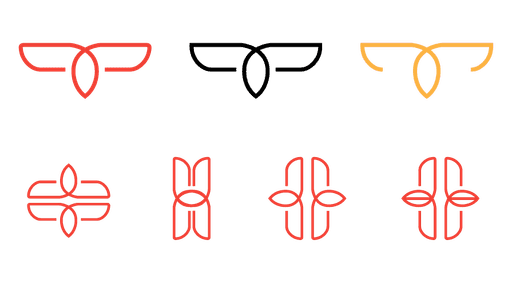
Final Logo
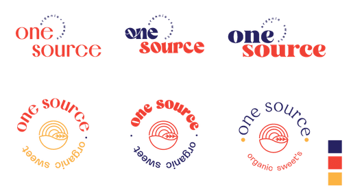
The final logo for One Sourz reflects the brand’s core values, symbolizing the process of turning seeds into organic products. It highlights growth, purity, and sustainability. The typeface used, KANNADA MN, complements the logo by adding a touch of modernity while maintaining the brand’s authentic feel.

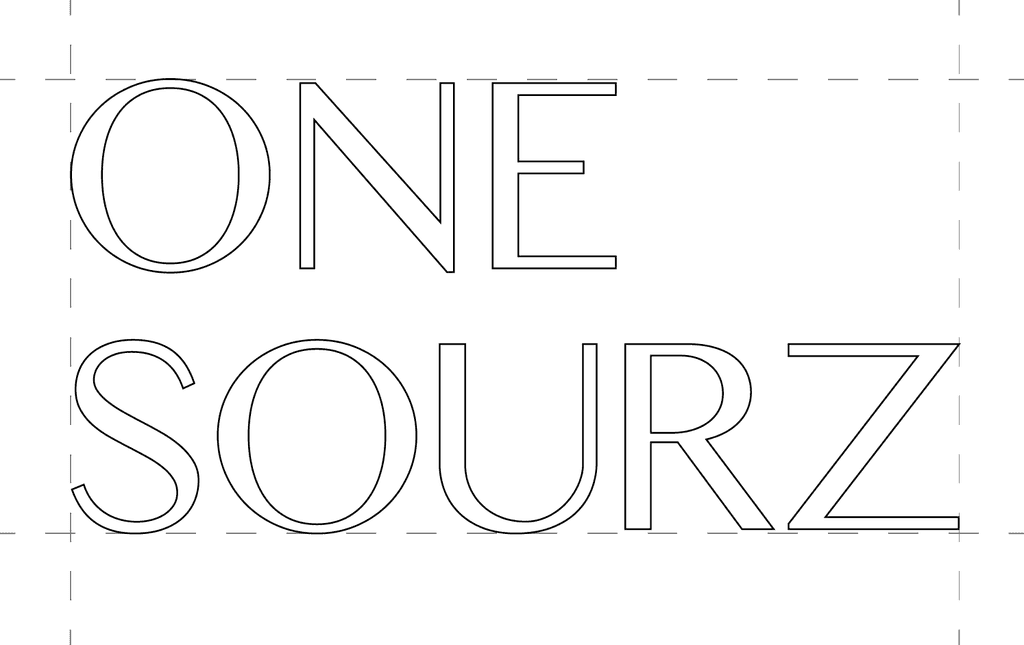
Word Mark
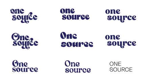
The One Sourz wordmark uses the KANNADA MN typeface, which has a traditional feel due to its roots in Indian scripts, yet carries a modern look with clean lines. This combination reinforces the brand’s balance of authenticity and modernity.
Kannada MN
Regular, Bold


Logo Mark
The One Sourz logomark symbolizes the brand’s natural origins and transformation. The earthy tones and vibrant colors reflect its organic nature.

Chikki Packaging
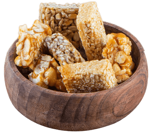
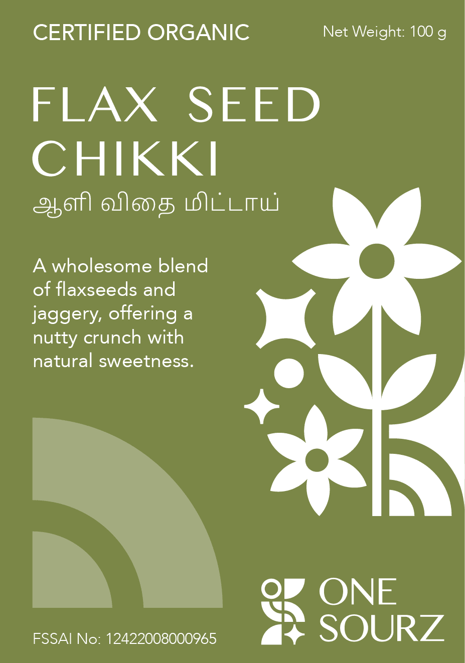
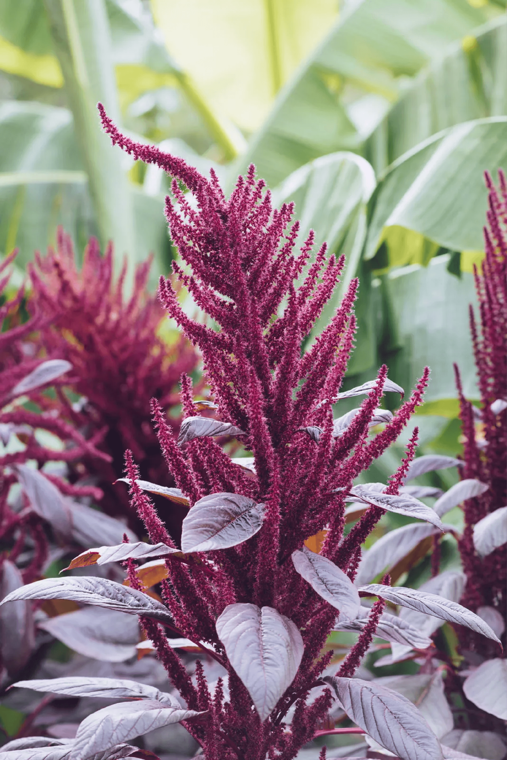
There are three chikki varieties: flaxseed, amaranth, and groundnut. The goal was to create packaging that highlighted the natural ingredients while maintaining a cohesive look across the product line. Each design uses vibrant colors and vector illustrations that reflect the organic and wholesome nature of the brand, ensuring a fresh, appealing presentation for each type of chikki.
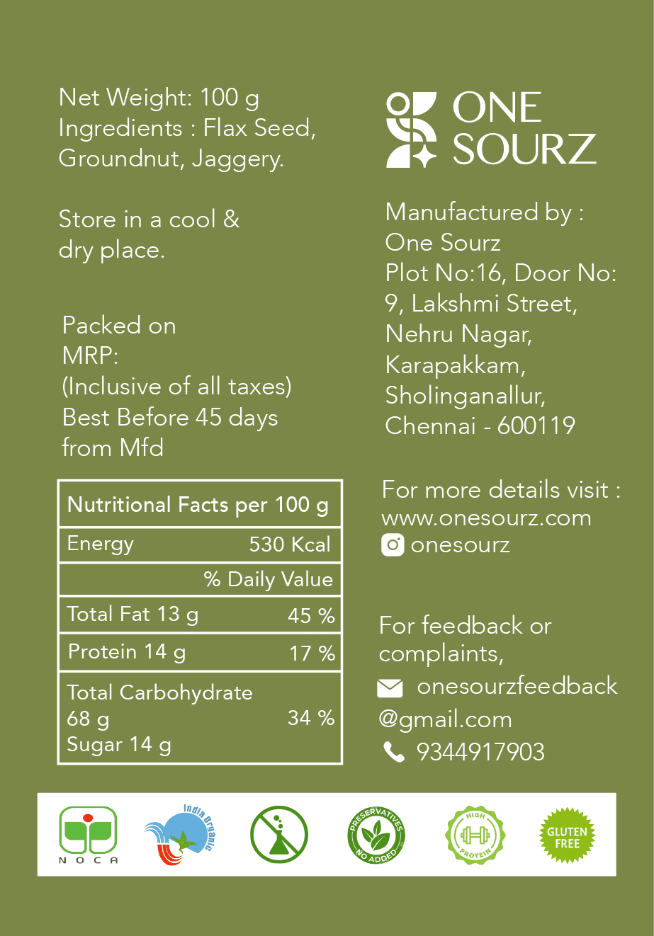


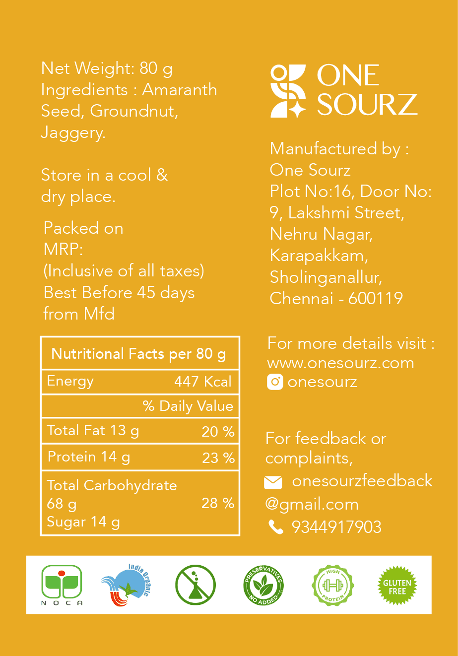
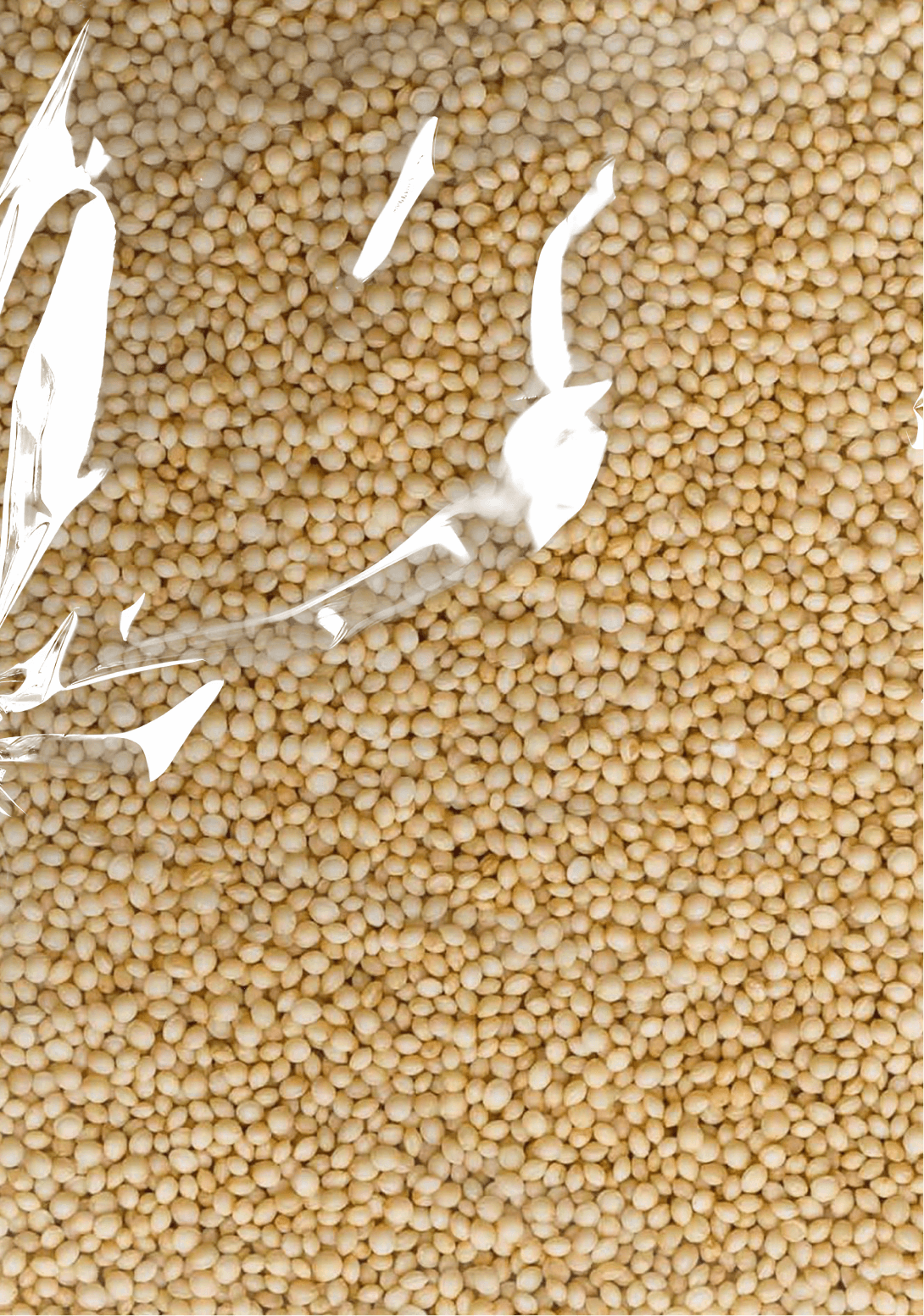
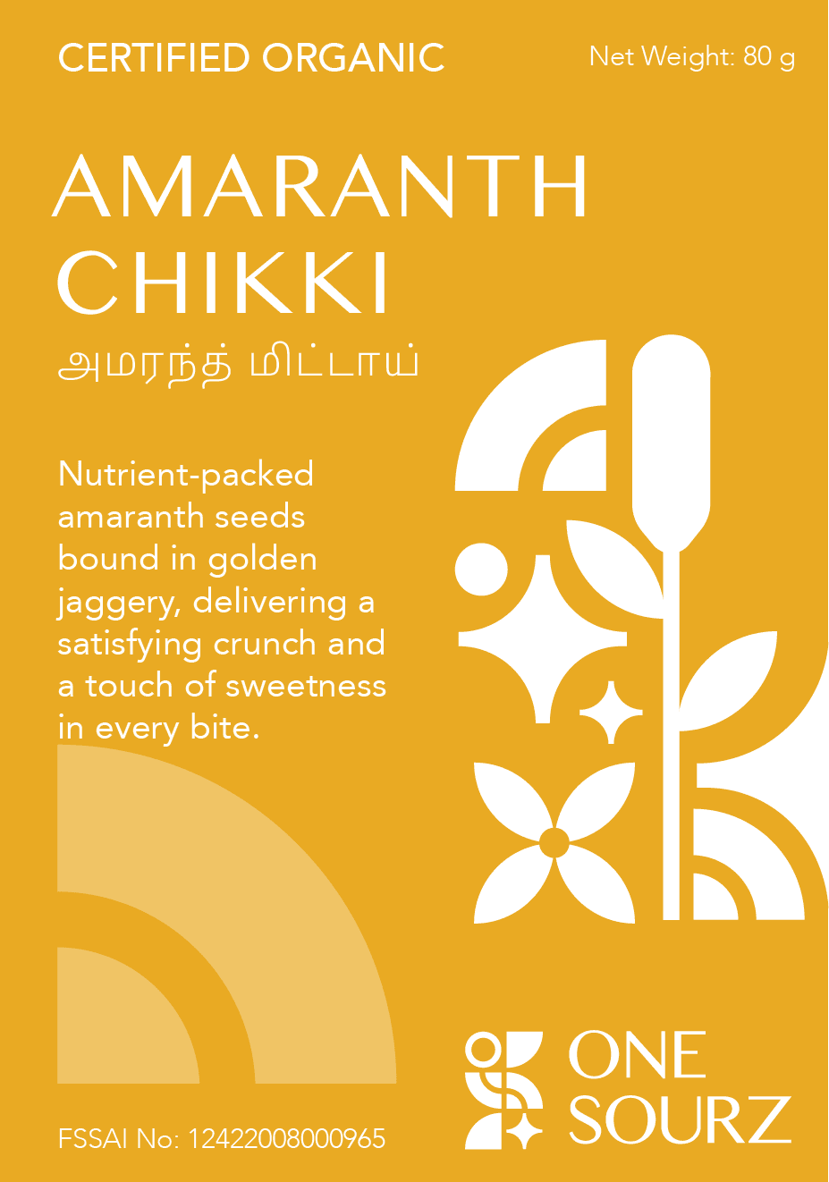
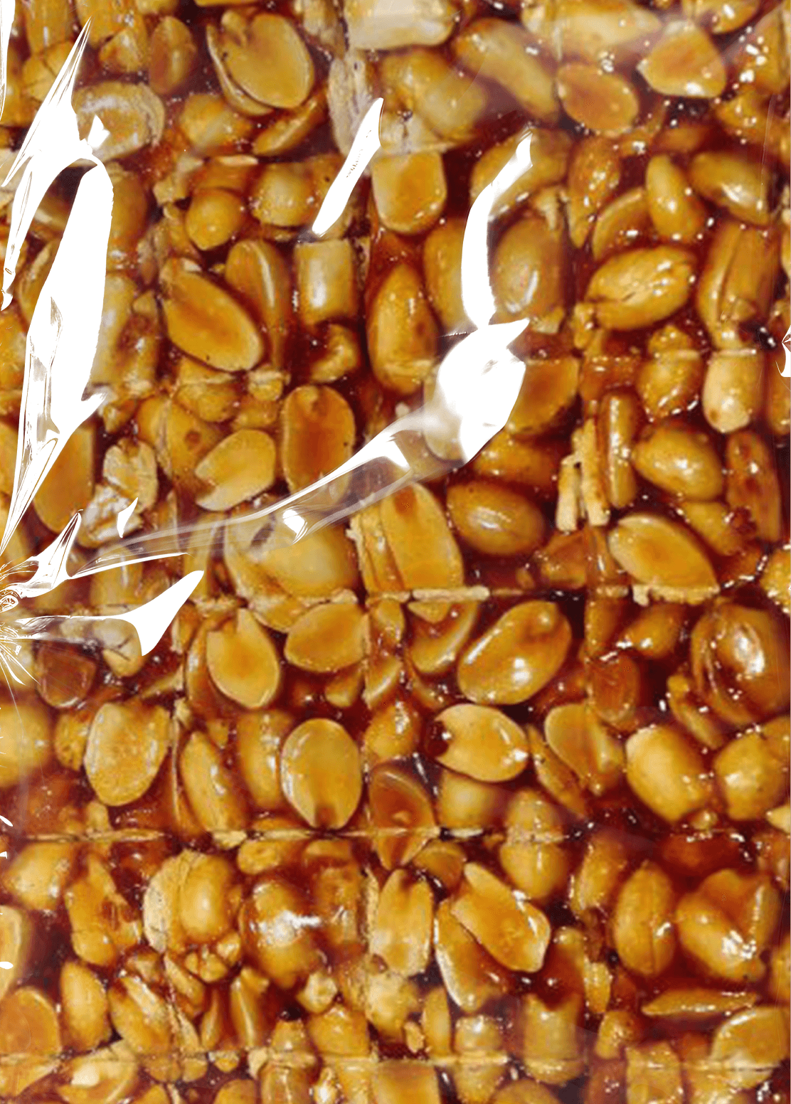
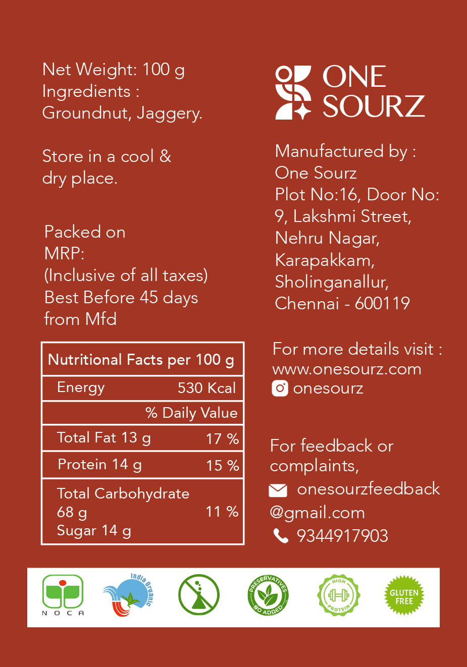

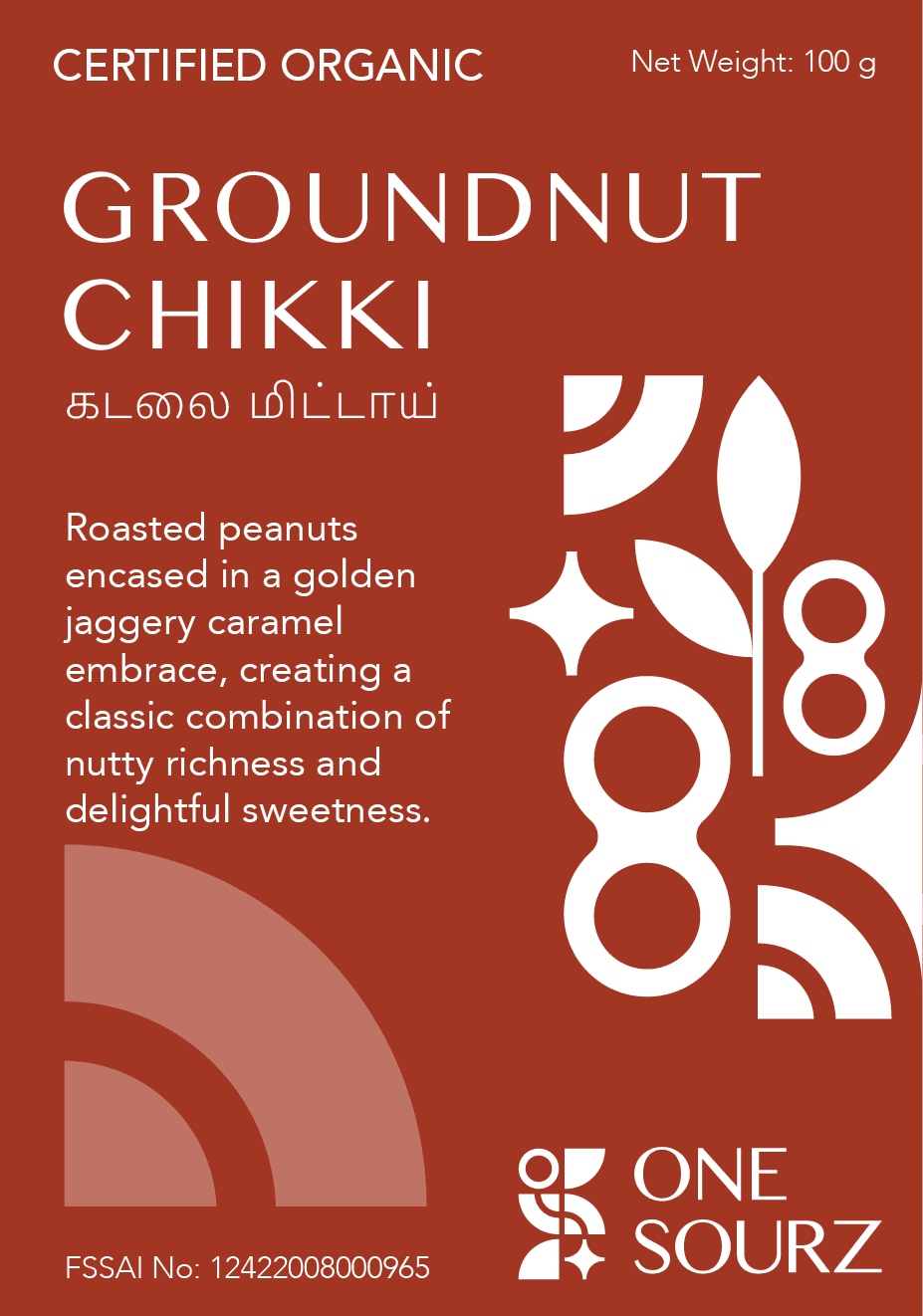
In order to maintain consistency in the brand language across different product lines, I made the decision to adapt the oil packaging to align with the same visual language and design elements used for the chikki packaging. This approach ensures a cohesive and unified brand identity for OnSourz, reinforcing its values an creating a harmonious visual experience for consumers.
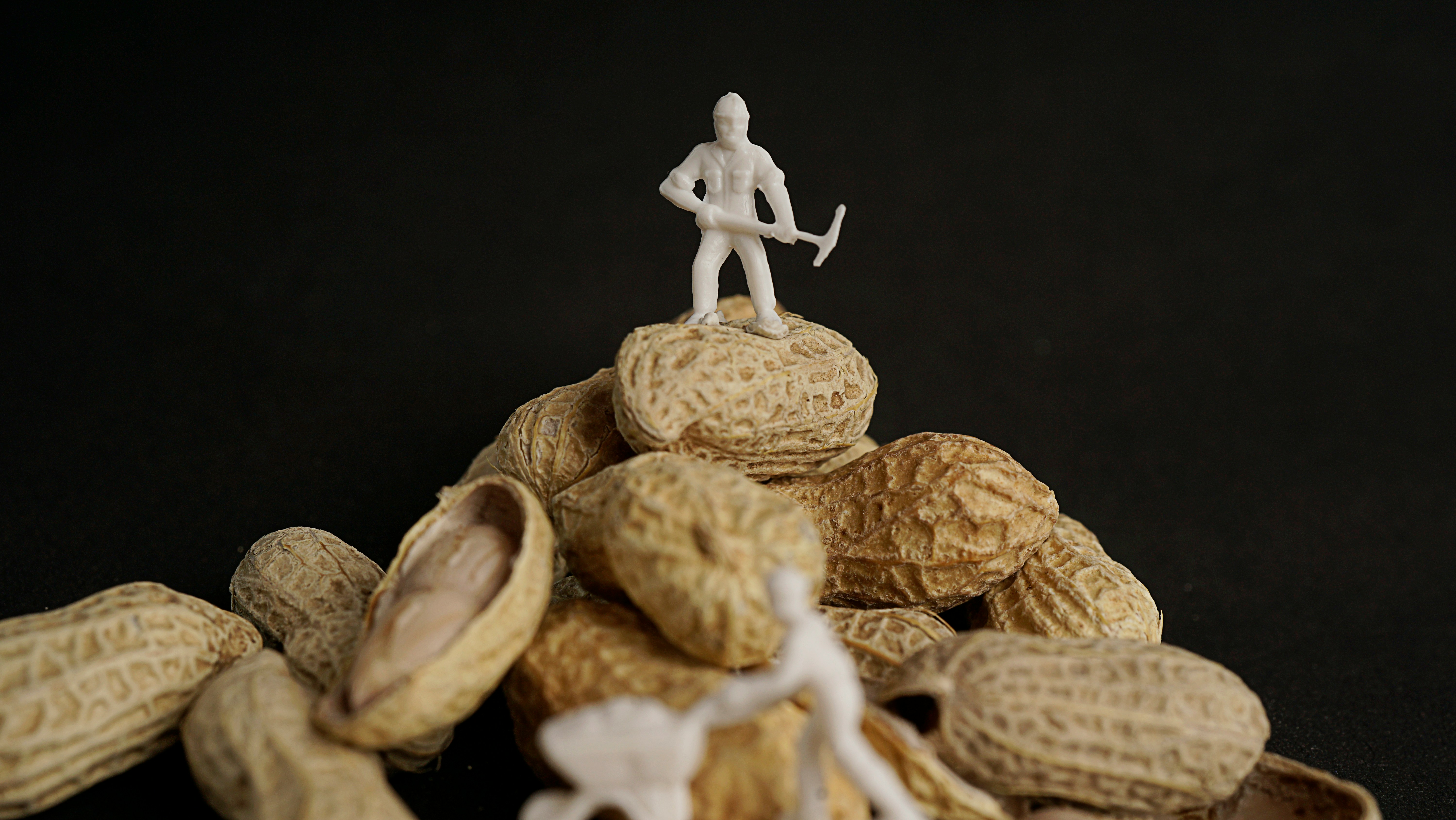


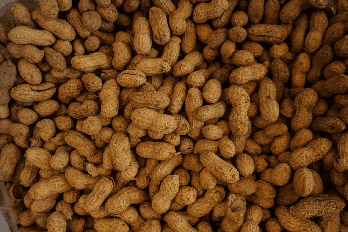


In order to maintain consistency in the brand language across different product lines, I made the decision to adapt the oil packaging to align with the same visual language and design elements used for the chikki packaging. This approach ensures a cohesive and unified brand identity for OnSourz, reinforcing its values an creating a harmonious visual experience for consumers.




Flaxseed Chikki features a vector illustration of the flaxseed plant’s flower. The design focuses on the flower’s natural elegance, using the color green to represent the organic essence of the plant. This illustration highlights the connection to nature, reinforcing the purity and wholesomeness of the product.





Oil Packaging
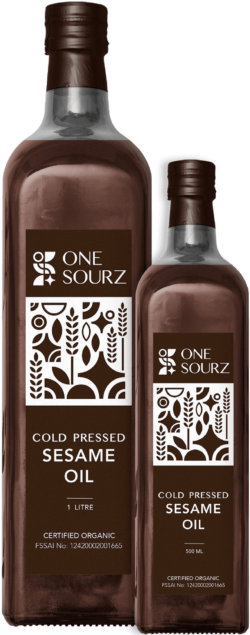
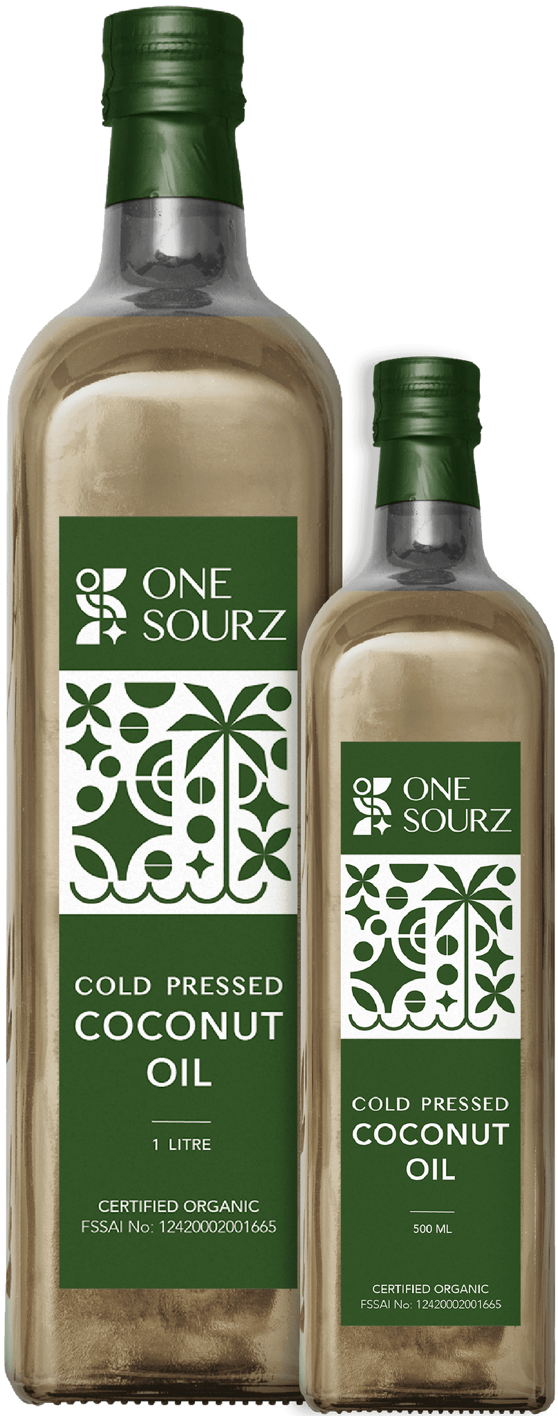
One Sourz oil packaging, I designed vector illustrations for each variety—cold-pressed sesame oil, cold-pressed groundnut oil, and cold-pressed coconut oil. These illustrations depict the origin plants of each oil, highlighting their natural and organic roots. This gives each product a distinctive and meaningful identity.
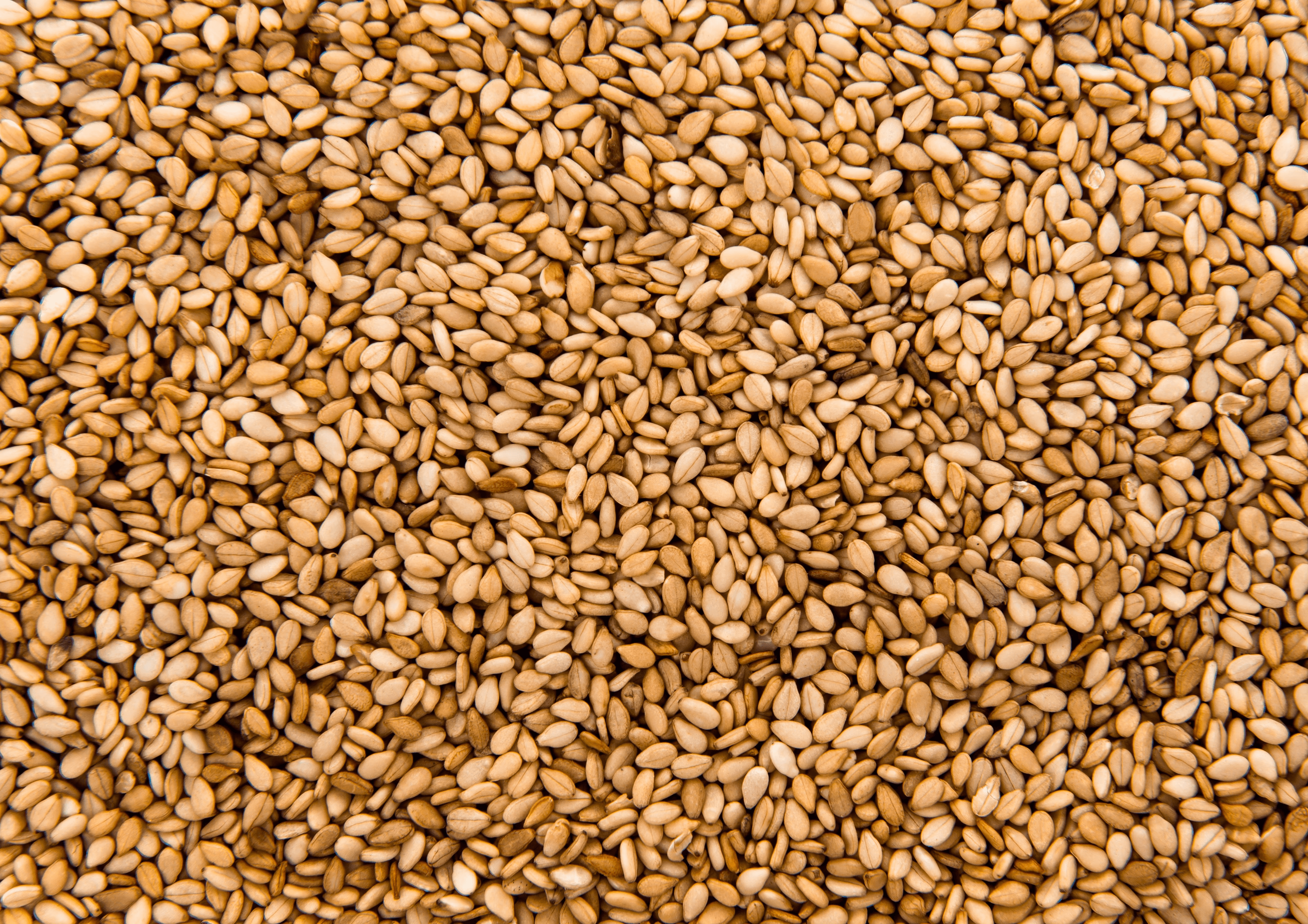
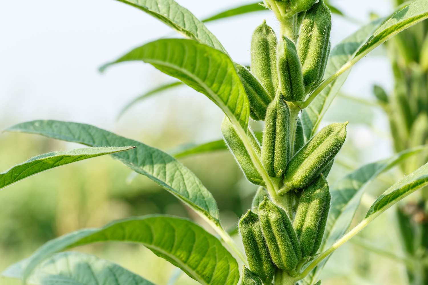
Cold-Pressed Sesame Oil features a vector illustration of the sesame plant. The design uses a rich brown color to reflect the plant's natural and organic origins. This illustration highlights the sesame plant’s distinct features, reinforcing the product’s connection to its pure, high-quality source.





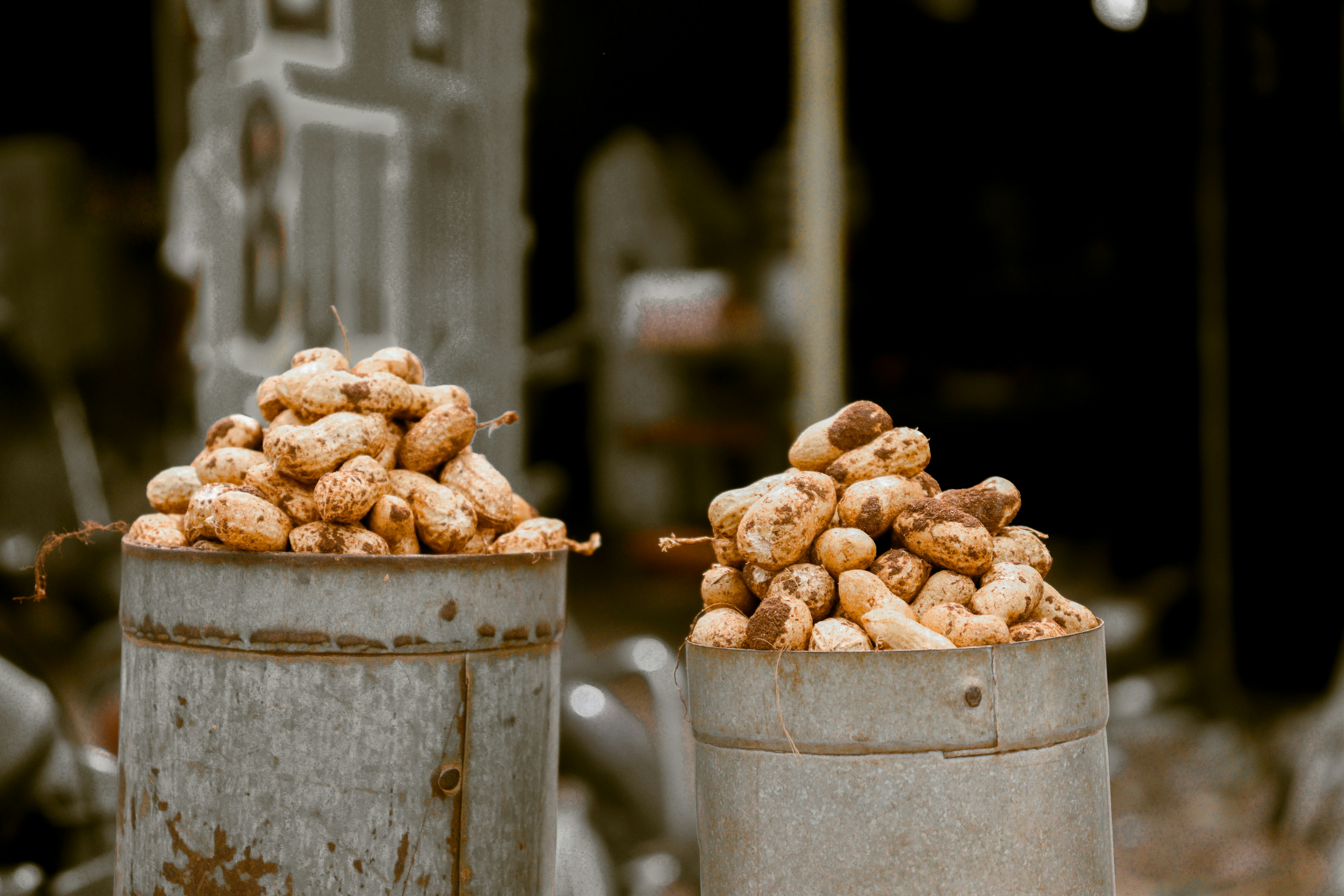
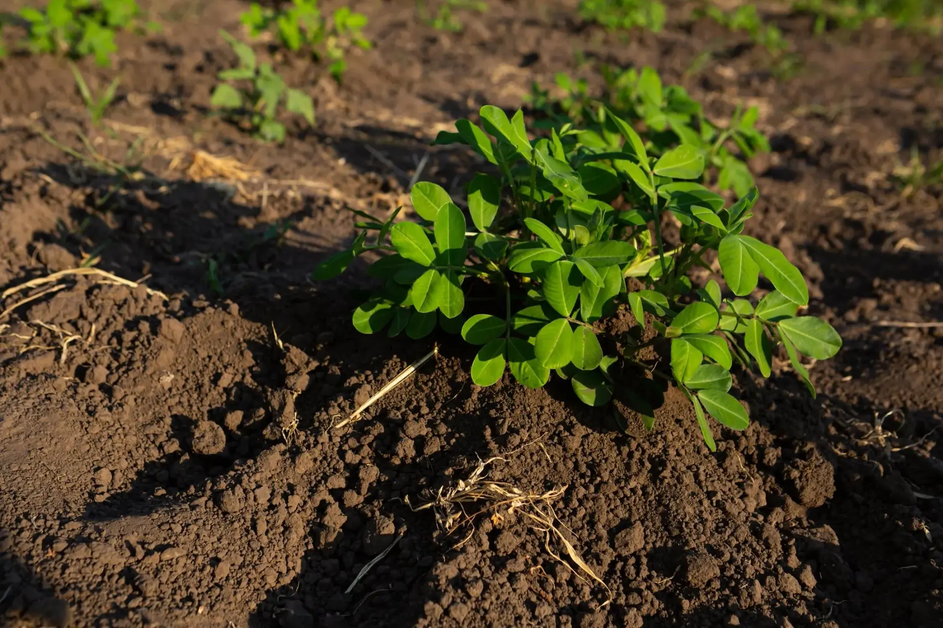
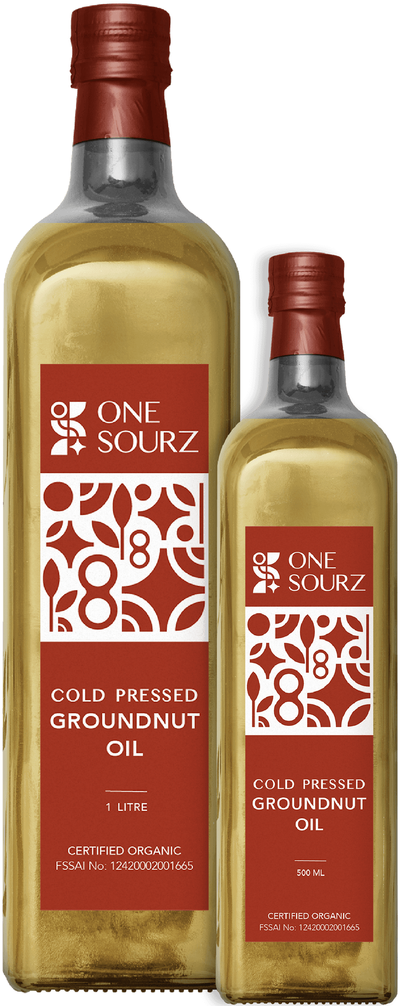
Cold-Pressed Groundnut Oil, the packaging includes a vector illustration of the groundnut seed. The design employs an earthy color to emphasize the seed’s natural simplicity and robust flavor. This visual representation ties the product to its origin, reflecting the brand’s commitment to authenticity and quality.




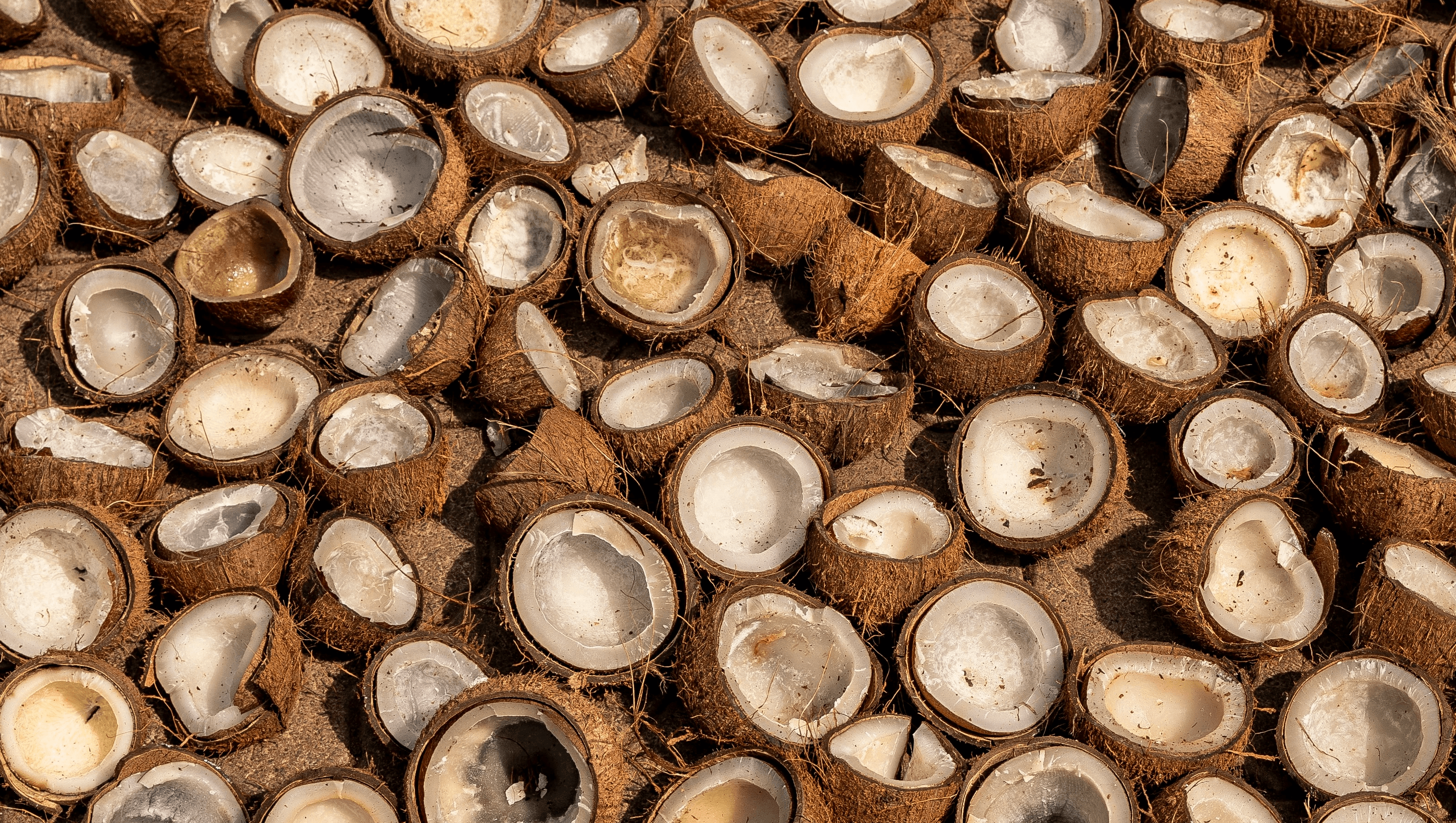
Cold-Pressed Coconut Oil showcases a vector illustration of the coconut tree. The design uses a fresh green color to highlight the tree’s natural beauty and the product’s organic origins. This illustration emphasizes the coconut oil’s connection to its source, aligning with the brand’s dedication to natural, high-quality ingredients.





Ladoo Packaging
Maintaining the consistency in the brand language across different product lines, For One Sourz ladoo packaging, I designed vector illustrations for each variety—Ragi Ladoo, Black Sesame Ladoo, Groundnut Ladoo, Flaxseed Ladoo, and Besan Coconut Ladoo. Each illustration represents the key ingredient of the ladoo, highlighting its natural and organic essence.
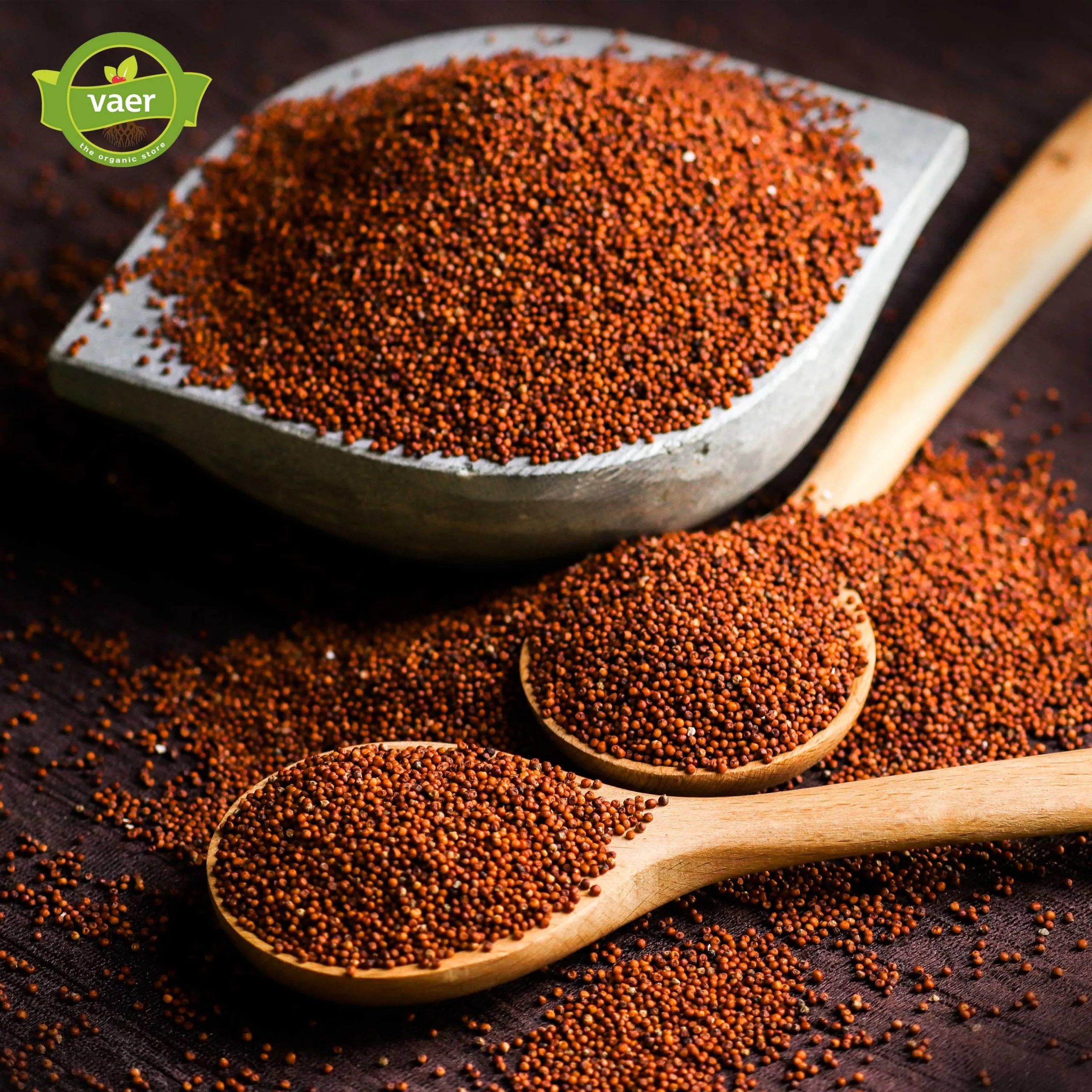

Ragi Ladoo features a vector illustration of the ragi plant. The design utilizes a deep brown color to highlight the plant’s earthy and nutritious qualities. Ragi, also known as finger millet, is renowned for its high nutritional value and is a staple in traditional diets.


